
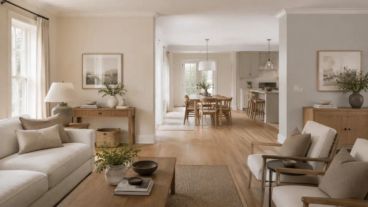
A paint colour may look neutral in a shop and unexpectedly pink, yellow, green or blue at home. The reason is its undertone. Understanding warm vs cool paint colours helps you coordinate walls with flooring, furniture, curtains and lighting before spending money on the full quantity.
Warm vs Cool Paint Colours in Natural and Artificial Light
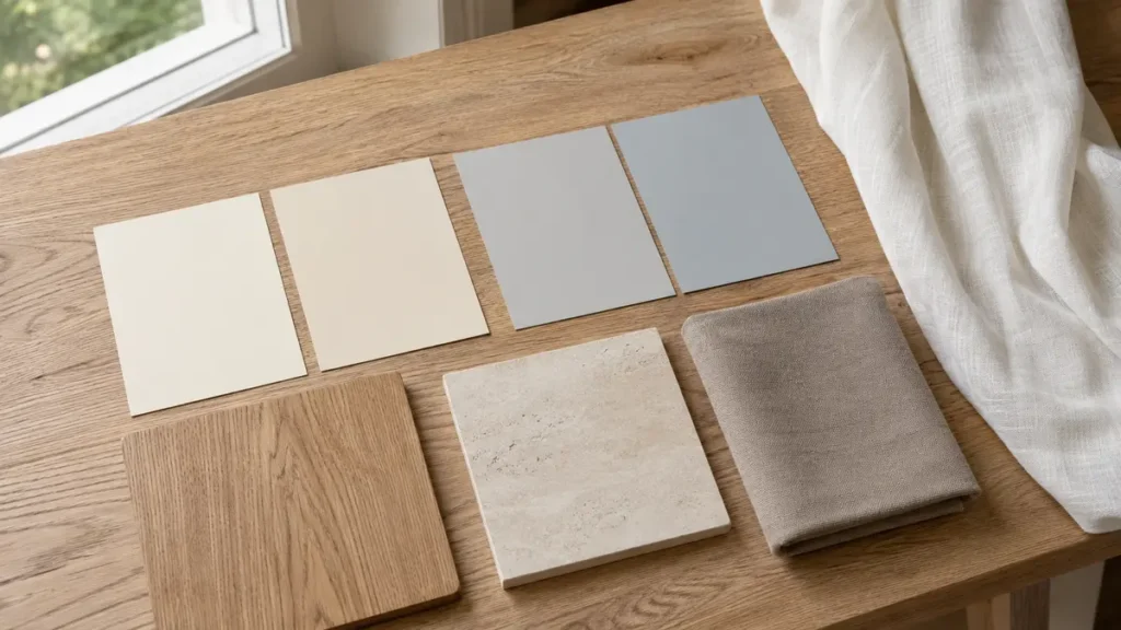
When comparing warm vs cool paint colours, examine the samples at different times of day. Natural daylight can make colours appear clearer, while warm evening bulbs may add yellow tones and cool LEDs can create a blue or grey appearance. Place large painted sample boards beside the flooring, curtains and main furniture rather than testing only a small patch. Understanding warm vs cool paint colours also helps you connect adjoining rooms without creating sudden colour changes. Before purchasing furniture and finishes, read our guide on how to furnish a new home so the complete colour scheme remains coordinated. Always review warm vs cool paint colours in the actual room before making the final decision.
Table of Contents
What Is a Paint Undertone?
The undertone is the subtle colour beneath the main colour you first notice. Beige may carry yellow, peach, pink or grey; grey may lean blue, green, violet or brown. Whites also have undertones, which is why two white surfaces can clash.
Warm and Cool Undertones
- Warm: yellow, red, peach, orange or warm-brown influence.
- Cool: blue, green or violet influence.
- Balanced: relatively neutral, although every colour changes beside other materials.
Use Fixed Finishes as Your Guide
Place paint beside the actual floor, stone, cabinets and sofa fabric. Warm cream stone generally cooperates with warm neutrals, while a blue-grey tile may suit cooler paint. You can mix temperatures deliberately, but one repeated bridge colour should connect them.
Compare Colours Against White
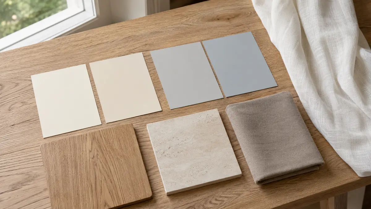
Place several similar samples on plain white card. Their hidden yellow, pink, green or blue tendencies become easier to see. Then remove the white card and assess the finalists inside the room.
Check Daylight Direction
Cool northern or shaded light can strengthen blue and grey notes. Strong warm sunlight may intensify cream, yellow and red. The same paint can therefore behave differently in two rooms.
Check Artificial Lighting
Warm-white bulbs add warmth; cooler bulbs emphasize blue and green. Test paint with the lighting you will actually use, including lamps, not only the ceiling fixture.
How to Test Correctly
- Narrow the choice to three or four colours.
- Apply two coats to large movable boards.
- Place boards beside flooring, curtains and upholstery.
- Move them to every wall.
- Observe morning, afternoon and night conditions.
- Choose only after viewing for several days.
Common Undertone Mistakes
- Calling every beige warm and every grey cool
- Matching colours by name instead of physical samples
- Comparing paint on a strongly coloured existing wall
- Ignoring tile grout, wood stain and countertop colour
- Using different whites without checking them together
Helpful Shopping Links
Affiliate disclosure: As an Amazon Associate, Djeema Furniture Guide earns from qualifying purchases. If you buy through these links, we may earn a commission at no additional cost to you.
Final Thoughts
Undertones become manageable when colours are compared rather than judged alone. Let fixed finishes lead, test large samples in the actual light and check every white and neutral beside its neighbouring materials.