
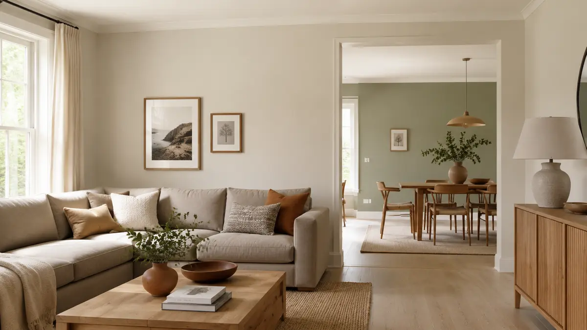
Choosing paint room by room without a shared plan can make a home feel disconnected. This guide explains how to choose wall paint colours by considering fixed finishes, daylight, room purpose and furniture before committing to a shade. Your paint selection should also coordinate with the wider plan for how to furnish a new home.
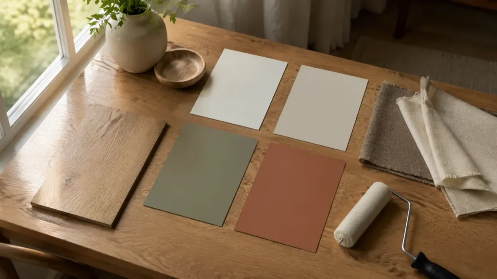
Start with What Cannot Easily Change
Place flooring, cabinet, countertop, stone and large upholstery samples together. Identify whether their undertones lean warm, cool or relatively neutral. Wall paint should support these permanent elements rather than compete with them.
Choose a Connecting Neutral
A calm off-white, beige, greige or light taupe can connect halls and open areas. Repeat it where rooms flow into one another, then introduce controlled variations in bedrooms and enclosed spaces.
Judge the Actual Light
North-facing or shaded rooms often benefit from warmer colours, while bright rooms can tolerate cooler or deeper shades. Artificial lighting also changes paint, so examine large samples in morning, afternoon and evening conditions.
Living Room Colours
Begin with the floor and sofa. Warm whites, soft greiges and muted earth tones are flexible backgrounds, while olive, clay, blue-grey or cocoa can create a controlled feature when repeated in textiles or art.
Bedroom Colours
Bedrooms usually suit quieter, lower-contrast palettes. Muted blue, sage, warm stone, dusty rose and gentle taupe can feel restful. Check the colour beside the headboard, wardrobe and curtains before painting every wall.
Kitchen and Dining Colours
Cabinet and countertop undertones should lead. In dining rooms, slightly richer colour can create warmth, but it should remain compatible with the adjoining kitchen or living area.
Bathroom Colours
Compare paint with tiles under the installed lighting. Select a finish formulated for humid areas, and avoid assuming that every white works with every white tile.
Hallways and Small Rooms
Hallways need not always be bright white. A warm light neutral can soften shadows. Small rooms may successfully use deeper colour when lighting, ceiling and furnishings are planned together.
Use the Right Finish
- Matt or flat: Calm appearance for lower-traffic ceilings and walls.
- Eggshell: Subtle sheen with practical washability for many living spaces.
- Satin: More durable for kitchens, bathrooms and busy areas where appropriate.
- Semi-gloss: Useful for selected trim and doors, but reveals surface imperfections.
Test Before Buying the Full Quantity
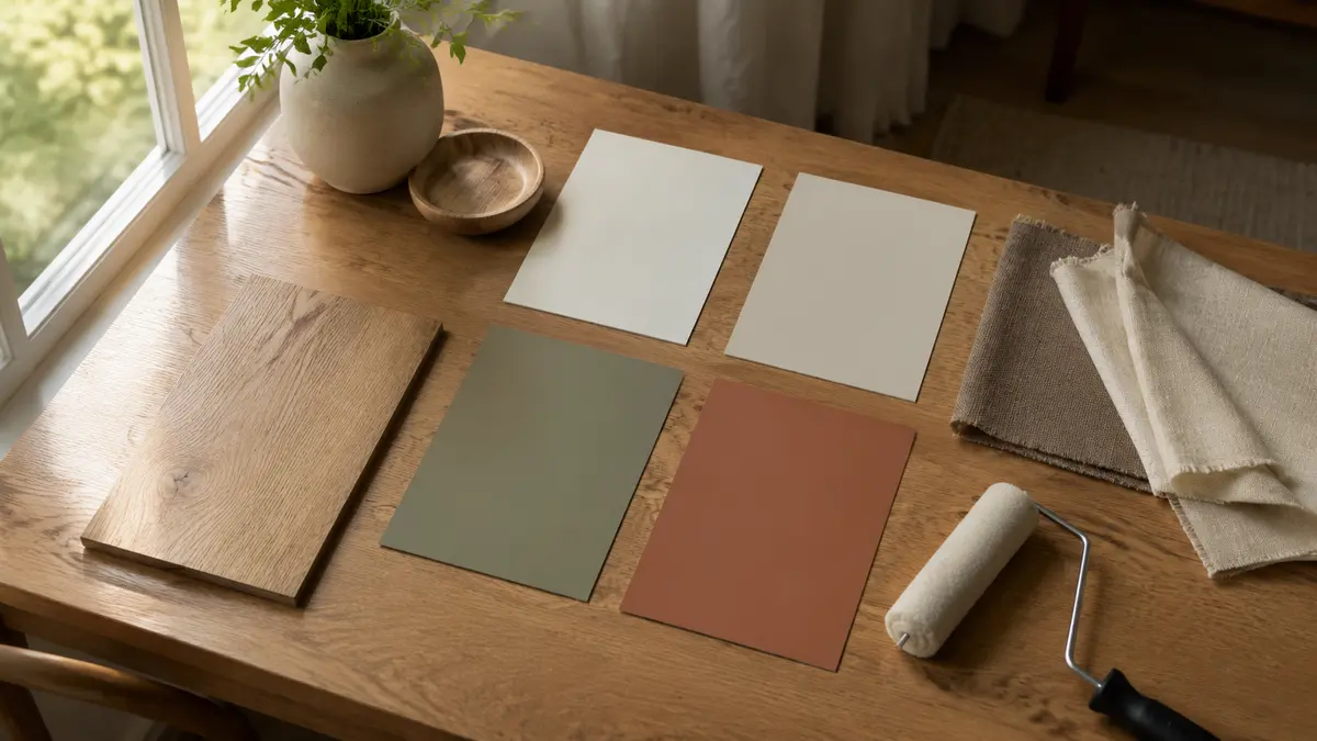
Paint movable sample boards or generous wall sections with two coats. Position them on different walls and keep them for several days. A tiny printed chip cannot reveal how a colour behaves across a full room.
Common Paint-Colour Mistakes
- Choosing paint before flooring and large furniture
- Testing only under shop lighting
- Using unrelated feature colours in every room
- Ignoring undertones in white and neutral paints
- Choosing sheen without considering wall condition and cleaning
Helpful Shopping Links
Affiliate disclosure: As an Amazon Associate, Djeema Furniture Guide earns from qualifying purchases. If you buy through these links, we may earn a commission at no additional cost to you.
How to Choose Wall Paint Colours for Different Rooms
When deciding how to choose wall paint colours, consider the purpose of each room. Soft neutrals, warm whites and gentle earthy shades can create a welcoming living room, while calm blues, muted greens and subtle greys may help a bedroom feel restful. Kitchens and dining rooms can handle warmer or more energetic colours when they coordinate with the cabinets, flooring and furniture.
Always test paint samples directly on more than one wall before making your final choice. Observe them in natural daylight and under the room’s evening lighting because the same colour may look very different throughout the day. When learning how to choose wall paint colours, also compare each sample with existing curtains, upholstery, flooring and wood finishes to create a balanced result.
Final Thoughts
The right paint colour is not selected in isolation. Connect it to fixed finishes, test it in real light and repeat a controlled palette through adjoining rooms. This creates variety without losing visual continuity.