
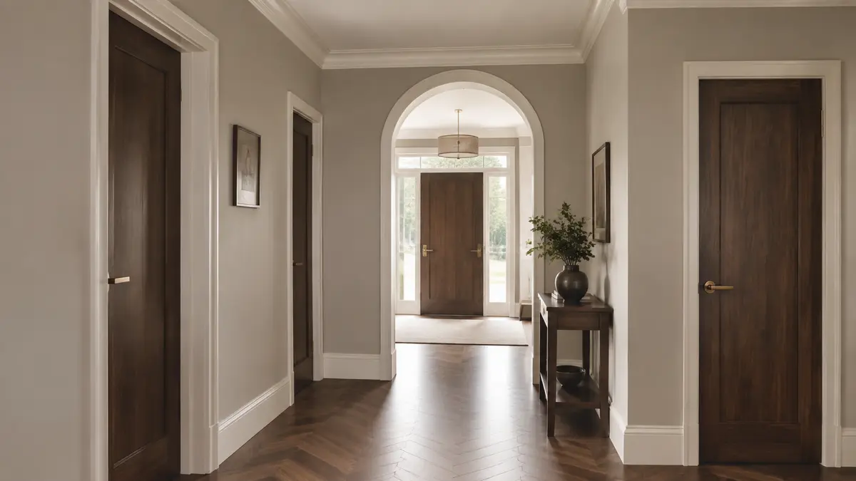
Skirting boards, doors, architraves and ceiling trim create the visual outline of a room. Their colour can make walls feel taller, sharpen architectural details or create a quieter continuous background. This guide explains how to choose skirting, door and trim colours that coordinate with walls, flooring and furniture.
Choose Skirting Door and Trim Colours with Confidence
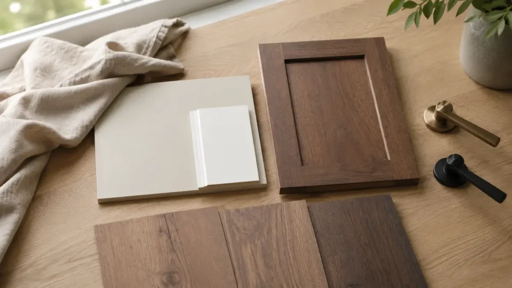
o choose skirting door and trim colours confidently, compare every sample beside the wall and flooring under both daylight and evening lighting. White is not always neutral; some whites have warm yellow undertones, while others appear cool or grey. When you choose skirting door and trim colours, repeat the same finish throughout connected spaces to create a consistent appearance. For broader planning, read our guide on how to furnish a new home before finalising finishes and furniture.
Table of Contents
Decide Whether Trim Should Contrast or Bled
Contrasting trim emphasizes doors, windows and wall edges. Matching or closely related trim creates a softer modern appearance. Neither approach is automatically correct; base the choice on the architecture, ceiling height and desired level of detail.
Using White Trim
White trim can look crisp, but the undertone must suit the wall and floor. A cool blue-white beside warm cream walls may appear harsh, while a warm off-white can connect naturally with timber and beige stone. Compare samples side by side.
Painting Trim the Wall Colour
Using the same colour on walls and trim can make small rooms feel calmer and reduce visual interruption. Change the finish rather than the colour—for example, washable matt walls with satin trim—to preserve subtle definition.

Dark Doors and Trim
Charcoal, black, deep olive or dark brown doors can add structure to a light interior. Repeat the dark colour in lighting, hardware or furniture so it does not appear isolated. Dark skirting is more visually dominant and may reduce the apparent wall height.
Natural Wood Doors
Coordinate wood doors with the floor’s undertone without attempting an exact match. Slight contrast is useful. If several doors are visible together, keep their finish consistent unless the design intentionally separates zones.
Coordinate Door Hardware
Handles, hinges and locks should relate to other metal finishes. Black, brushed nickel, chrome, bronze and brass each create a different effect. Repeating one primary metal throughout connected spaces produces order.
Consider Practical Maintenance
Skirting and doors receive frequent contact. Use a durable, cleanable finish suited to the material and location. Higher sheen reveals surface defects, so preparation and sanding remain important.
A Simple Selection Process
- Collect flooring, wall and cabinet samples.
- Choose whether trim should blend or contrast.
- Test two or three trim colours on large boards.
- Compare samples vertically and horizontally.
- View in daylight and evening lighting.
- Confirm the sheen and hardware before final painting.
Common Trim-Colour Mistakes
- Using any available white without checking its undertone
- Choosing door colour separately from the floor
- Adding dark trim without repeating dark accents
- Mixing hardware finishes randomly
- Ignoring surface preparation and durability
Helpful Shopping Links
Affiliate disclosure: As an Amazon Associate, Djeema Furniture Guide earns from qualifying purchases. If you buy through these links, we may earn a commission at no additional cost to you.
Final Thoughts
Trim should support the architecture and connect walls with floors and doors. Decide whether it will blend or contrast, test undertones together and use durable finishes appropriate for daily contact.